Creating a neo-vintage brand
To bring a brand to life, a designer needs to involve the client and their vision. In this project, I created a brand identity with neo-Victorian aesthetics.
Problem
A brand is a name, as much as it is a visual identity. It should convey a sense of uniqueness; tie in with company values. And worn like a name, it should stand on its own merits and be recognised at a glance. In a sense, a brand is like a living entity.
But identities don't just emerge overnight; as it is with people, there is a degree of exploration, interpretation, reflection, and reiteration required.
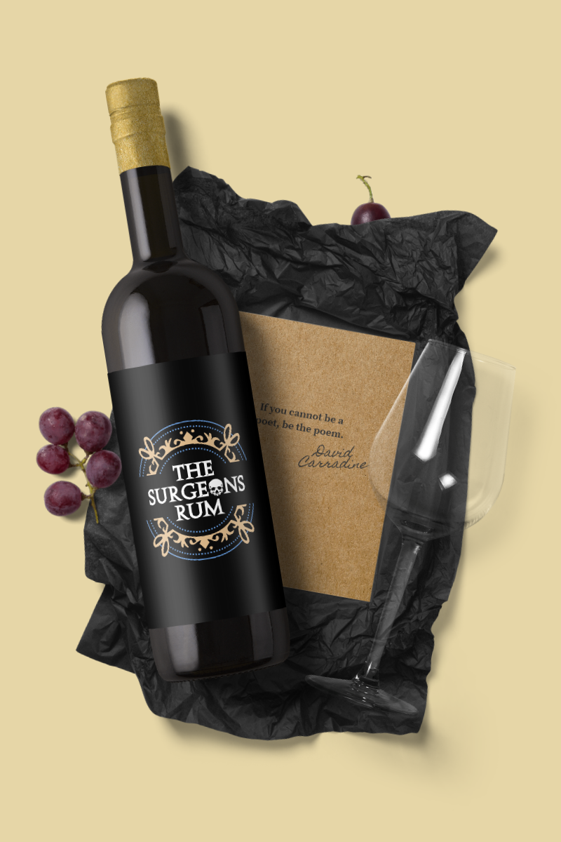
Such was the case when I was approached by The Surgeons Rum, and presented an opportunity to bring to life, and shape, their brand. I was asked to design and develop a colour palette, logo, and bottle cap that would resonate a Victorian influence and incorporate a medical reference.
Client
The Surgeons Rum
Project type
Tools
Krita InkScape Wacom Cintiq
Project link
Approach
The Surgeons Rum planned to target their products at an upper, middle-class, male audience. In addition to ‘vintageness’, the product had to project a sense of class, quality, and masculinity. To better understand these characteristics, and how I might be able to communicate them, I decided to research the style of the Victorian era, as well as modern-day depictions of it.
To broaden my source of inspiration, I took into consideration men’s clothing, medical tools, colours, bottle designs, seals, and labels from the 19th century.
Once I had an idea of what made this period stylistically unique, I intended to emulate it across my designs. To ensure that I met the client’s needs, I made sure to consider feedback and direction at the end of each design cycle.
Process
The client and I explored different compositions, Victorian iconography, and embellishment styles. At the end of each reiterative process, the client’s feedback influenced the direction and ideas I incorporated.
The final design emerged through combining 2D representations of a wax seal, human skull, and surgical scissors.

I proposed using Stowe Open Face for the font because it gave the logo a sense of symmetry. Most of the other Victorian fonts that were considered drastically shifted the perception of this. The skull design also matched the character map dimensions very well.

Across my observations, I found that neo-Victorian aesthetics incorporated dark varieties of navy blue, white, black, and brown. This colour palette resonated with my client; the final colour scheme was a saturated derivative inspired by Sherlock.

The client and I explored different coloured renders of the logo and bottle cap. For the final design, the brand name and skull were emphasised through the use of contrast.
Outcome
The client was pleased with the final design; it now represents the brand on social media and will feature on future packaging.
 and bottle cap (right).")