Visualising scientific findings
Effective communication is about adapting to fit your audience. In this project, I summarised the conclusions of a research paper with a single illustration.
Problem
Science journals have a long history of being jargon-heavy, wordy, and almost exclusively available through academic channels. They are inaccessible to the everyday person, yet the knowledge and discoveries they contain are relevant to all of us.
A recent paper by researcher Nasreen Peer, for example, looked at different fiddler crab species found along the South African coast. The conclusions from her studies have implications that relate to climate and biodiversity.
But published in an academic ecology journal with jargon and statistics, research like Nasreen’s is set to be seen mostly by a circle of other scientists. The information isn’t available in the right medium, nor is it adapted to communicate to the demographic who will be affected by future environmental issues.
Client
Illustrated Research
Project type
Tools
Krita InkScape Wacom Cintiq
Approach
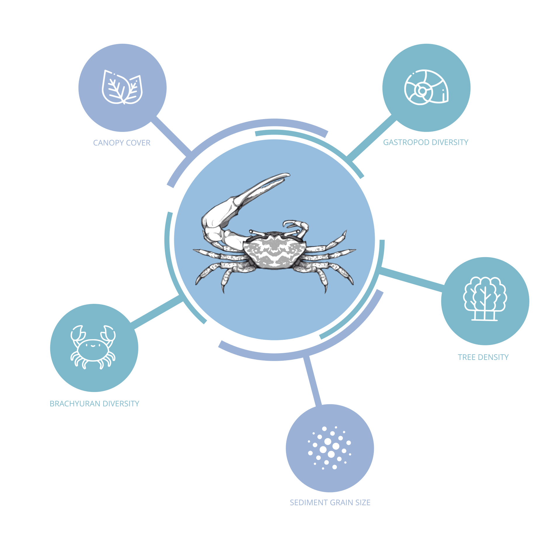
The main conclusion of Nasreen's research was that fiddler crabs are affected by abiotic and biotic factors. I decided on an infographic approach to summarise, but simplify, these two types of ecological factors. My goal was to show that they influence the crabs and to keep information overload to a minimum.
To achieve this, I decided to omit the exact statistical details that would describe the degree to which the various factors impacted the crabs. I also opted for a mindmap format, which would let me visually relate the effect ecological components had on crab populations.


Process
Liaising with Nasreen, I gathered several reference images representative of the fiddler crabs she studied. From there, I constructed a single fiddler crab outline and then created different ‘skins’ to overlay on top of my illustration.

I assigned icons to the terminology used throughout the science article.
To distinguish between abiotic and biotic factors, I developed a coloured graph key. I made sure that the colours were similar to each other to minimise visual distractions.

When arranging the mindmap, I made sure to contrast the icons and text against the background colour to maximise readability for social media and print.
Outcome
Nasreen was delighted with the result, and the finished infographic featured on Instagram and in the science magazine Yesterday, Today, Tomorrow as part of the 2019 Women in STEM campaign.
